Good Morning Bar Website
A company with the goal of keeping athletes, gym-goers, and anybody working up a sweat to stay hydrated, all with the help of their signature bar.

Project Summary
Good Morning Bar is a start-up company that was in need of a professional website that it could both advertise itself on and conduct business with (i.e. make transactions). Utilizing the free website builder WordPress as well as a pre-made theme and various plugins, I designed and created a multi-page website, including a landing page, shop, contact page, and more. It remains under development as it is pending actual products and official content from the company head.
Responsibilities
Market Research
Requirements Solicitation
Wireframing


Market Research
Initially, I spent time compiling a list of various competitors in the power/granola bar market, including some of the most popular brands such as Clif bar, RXBAR, LARABAR, KIND, and ProBar, to name a few.
A common theme that I knew would be important for Good Morning Bar's website was to ensure that the product was immediately presented to the user, in addition to a prompt for the user to sign up for emails, or something of that sort in order to give them a call to action as soon as they entered the website.
Documentation
The next step was to ensure that all of the work I was doing was properly documented, and as such I created a Technical Requirement Specification Document, which in this case included an overview of the product, company, and project scope; deadlines for each step of the project; a tentative sitemap; wireframes; and functional requirements.
Wireframes
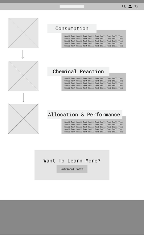
Since the company had decided to use WordPress for website development, tools like wireframes did not need to be prioritized highly, since website builders allow for great flexibility and have a quick feedback loop to integrate changes with. Nonetheless, I wanted to develop some wireframes for the main pages of the website, as seen below.
Mockups
Additionally, higher-fidelity mockups of some pages of the website were developed in order to achieve a more accurate visual of the final website look and get feedback regarding certain elements and layout choices.
Project Completion
After recieving feedback regarding the mockups and ideation process, I began adding elements page by page, utilizing stock images and filler text to create the website. The branding book provided for Good Morning Bar recommended the font 'Sofia Pro' to be used throughout the website; however since this was not readily available through WordPress, I opted for a similar font 'Poppins' as a substitute. The color scheme was also taken from the branding book, which is where the bright light sea foam green and dark navy blue colors originate from.
Throughout working on the website, I ran into several problems related to WordPress optimization and the nature of its open-sourced themes and plug-ins. As such, I spent a decent amount of time working through issues which included: the website not properly routing through HTTPS, leading to the website not being secure or not loading at all; and not initially understanding how to edit pages, which required learning how to use the various portals and editors required by the theme to edit the website.
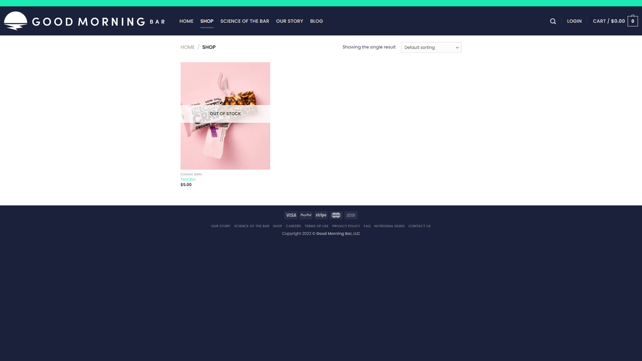
Building this project for Good Morning Bar was successful in that I was able to develop an interface that the CEO was happy with and that met all listed requirements. In its current state, the website appears as shown in the images below, pending content from the company.


